scrapbooking paper at Croppin Paradise

Friday, November 27, 2009

Tell Your Life Story!

A new year is upon us.. it is time to reflect on the past and make plans for the future! It is time to tell your stories; your own and that of your family and friends.... and what a better way to do that than using the new My Mind's Eye Life Stories Collection!!

The CP Design Team got to work with these beautifully muted, worn papers and fun embellishments and recorded some of their special stories! Check out their work....

Lisa - Best

Andrea - Sisters


GDT Kim - Big News
Go visit the store and get these fabulous products to help tell YOUR story! (then make sure you share them in the Croppin Paradise Gallery!

See you there!
xoxo
Trish

Monday, November 16, 2009

Meet Guest Design Team Member - Kim!

A new month means a new designer! I am excited to introduce you all to our Guest Design Team Member for November.....

Kim Bethke!!!!


We wanted to get to know Kim a bit better so we asked her all the most important questions:

1. How long have you been scrapping? I've been scrapping for about 13 years or so

2. How did you get started with scrapping? A friend went to a Creative Memories party and showed me her scrapbook and it looked like fun and something I would enjoy. Of course, being the frugal person I am, I went to Michaels (where my DH was a manager) and used his employee discount to get some basic supplies to start.

3. What are your 3 favorite manufacturers? Cosmo Cricket, Basic Gray, and Stampin Up

4. Where do you draw most of your inspiration? From checking out various galleries online and from online challenges. I've been called a "Challenge Queen"

5. If you were to describe your style, what would it be? Simple.

6. Is your scrapspace messy or neat? A little bit of both...when I'm in a scrappy mood, I just kind of throw all my scraps/tools in a pile until I'm all done, but then I clean it up...my space is in the family room, so I try to keep it somewhat respectable looking.

7. Do you snack while you scrap? What is your favorite scrappy snack? I love to snack on Chex Mix

8. If you could scrap with any "Celebrity Scrapper" who would it be and why? I don't really follow any "Celebrity Scrappers" to know who I would like to scrap with.

9. What is your favorite part of being a member at CP? Everyone is so friendly

And here are some of Kim's favorite projects! - They are sure to inspire!


Come on over to the Croppin Paradise forum and join Kim and the rest of the crew at CP for some fun and games!

P.S. - Friday, October 20th - Sunday, October 22nd CP is hosting a Black Friday Shop till You Drop Crop - come join the fun!!!

Sunday, November 8, 2009

Day Seven - Gradation

Day 7! The last design principle to explore is Gradation.

Gradation is the use of a series to form successive stages.

The eye naturally views a picture (or layout) from the bottom or the side. It then moves along the light spots or dark values in the layout, depending on which is dominant, resting on the focal area.

Gradation is one way to guide the eye around a layout! Gradation of size and direction produce linear perspective, while gradation of colour from warm to cool and tone from dark to light produce aerial perspective.

Gradation can also add interest and movement to an individual shape. A gradation from dark to light will cause the eye to move along the shape.

In the layout below I used Gradation of the honeycomb shape to guide the eye across the page by making the design narrow from 5 to 1 as it crossed the page. I also used Gradation of color within the design by using dark brown on the left and gradually moving to white on the right. This automatically draws your eye to move from the left to the right, while stopping to view the pictures and journaling along the way!

I challenge you to create a layout using Gradation! Load it to the Croppin Paradise gallery and then link it up to the Day 7 Challenge Thread for a chance to win a RAK! - You have until November 15th to complete all of the Design Element Challenges!


We hope you have enjoyed the Design Series this week! We hope reminders of these simple design principles will help you to create pages that "wow" every time! We cannot wait to see your work!


Thanks for joining us!


xoxo


Trish

Friday, November 6, 2009

Day 6 - Repetition

Welcome to Day 6 of our Design Series! I hope you have all been able to take these principles and either, apply them to your pages and/or look at your completed pages with a new sense of accomplishment! Either way, we hope you are enjoying learning about design.

Today's Design Principal is Repetition!
Repetition is the use of similiar objects or elements for a unified effect. Repetition acts as a visual key that ties your layout together. Repetition controls the reader's eye and helps you keep their attention on the piece as long as possible.

You can use repetition on your layouts by repeating elements such as a graphic or font style or size. To get started, repeat elements that you're already using.
In the layout below I repeated the circles throughout in order to control the viewer's eye and to tie the layout together.

Repetition is one of the easiest design principles to apply to your pages, so go and try it out! Upload your creation to the CP gallery and then link it back to the Day 6 - Repetition thread and be entered to win a RAK!

xoxo

Trish

Thursday, November 5, 2009

Day 5 - Balance

Balance is achieved in design when equal weight is given to visual elements to achieve an eye catching design. Balance can be affected by both the size of objects and their value (ie. lightness or darkness, termed visual weight).
There are 3 types of Balance:

1. Symmetrical Balance - Mirror image, imagine a central axis dividing the layout down the middle, horizontally or vertically, with the same design on both sides.

2. Asymmetrical Balance - Is achieved when several smaller items on one side are balanced by a large item on the other side, or smaller items are placed further away from the center of the layout than larger items. One darker item can be balanced by several lighter items.

Assymmetrical balance can be achieved using color, value, shape, position, texture and direction.

  • Small areas of bright color can be used to balance larger areas of more neutral colors,
  • Large flat areas without a lot of detail can be balanced by smaller shaped detailed objects since the eye is led towards the more intricate shape.
  • A larger weighted item closer to the center point can be balanced by a lighter weighted item further away from the center
  • Small textured elements can balance larger elements with smooth, untextured surface

  • Placing pictures with the subjects looking in a certain direction will cause the eyes to be led there

3. Radial Balance - where all elements radiate out from a center point in a circular fashion. It is very easy to maintain a focal point in radial balance, since all the elements lead your eye toward the center.

In this first layout I used symmetrical balance to create a page using a favorite quote. If you divide the layout in half horizontally, you get almost mirror images of each side.


In the layout below I utilized asymmetrical balance to design this page about my son visiting the dinosaurs at the museum. The large, round circle element is balanced by the large dinosaur in the right hand corner.

As you can see, using Balance is an easy, yet effective way to make your pages eye catchers! I challenge you to create a layout using Balance - upload it to the CP gallery and then link it to the appropriate thread for a chance to win a RAK!

Day 4- Dominance


Dominance relates to varying degrees of emphasis in design. It determines the visual weight of a composition, establishes space and perspective, and often resolves where the eye goes first when looking at a design. There are three stages of dominance, each relating to the weight of a particular object within a composition.
  • Dominant: The object given the most visual weight, the element of primary emphasis that advances to the foreground in the composition.
  • Sub-dominant: The element of secondary emphasis, the elements in the middle ground of the composition.
  • Subordinate: The object given the least visual weight, the element of tertiary emphasis that recedes to the background of the composition.
    I created this layout to demonstrate Dominance in scrapbook design.


    The Dominant object is my photo.  Other than the paper that frames it, it is the largest object on my page.  If I had used a smaller 4 x 6 photo the eye would not know where to rest first and the page would feel disorganized.
    Hope you've enjoyed this lesson in design today!
    Lisa
    The Sub Dominant object is the "M" title.  I kept it a light color so it wouldn't compete with the photo and it is visually smaller than the photo as well.  Being in the foreground of the cluster of embellishments brings it forward for the eye to go to after the photo.  I also placed it a little below and to the side of the photo to keep it unifed with the photo.  If I had just placed it randomly on the page, it would not have the dominant weight and again, the page would feel disorganized.
    The Subordinate element of my page is the little journaling tag. Visually, it's tied to the green glimmer misted bingo card, but it is also in the foreground of the page, so the eye rests on it third, creating the pleasing visual triangle of good design.

Tuesday, November 3, 2009

Day Three - Contrast

Today's design lesson is all about Contrast with Design Team Member Andrea!

John Lovett said this about contrast:

"Contrast is the juxtaposition of opposing elements eg. opposite colours on the colour wheel - red / green, blue / orange etc. Contrast in tone or value - light / dark. The major contrast in a painting should be located at the center of interest. Too much contrast scattered throughout a painting can destroy unity and make a work difficult to look at. Unless a feeling of chaos and confusion are what you are seeking, it is a good idea to carefully consider where to place your areas of maximum contrast."

I have two example of very different contrasts using the same black and white picture. In the first set of layouts, I used the black and white picture of my daughter on a black and white background. I first laid down the picture and embellishments on just a regular old piece of cardstock. There is no pop of color and everything just kind of blends together. In the second layout, I used a brilliant blue to really help the picture stand out among the repeating pattern. This is important because it allows the eye to rest and I think that it really grounds the layout. In the second set of layouts, I use contrast in a much different style. In the first picture I just laid down the picture directly on top of the 12 x 12 piece of paper. As you can see there is a definite sense of contrast. But take a look at the second layout, there is a lot going on!! Notice the contrast of black and white matted in color! There is also the contrast of single colors: eg. the green journaling block and the red ribbon and the blue/orange flowers. There is also a contrast in differing patterns . . . dots and dashes almost! As you can see, contrast can work for or against a layout. But if you are able to create contrast in your layouts, they become more visually interesting to those who reads your books! Consider trying this technique the next time you have free time to scrap!!

Next time you scrap think about how Contrast can work for you.. apply it to your layout, upload it to the Croppin Paradise gallery and to the appropriate challenge thread in our forum and be entered for a chance to win a fabulous RAK!

See you soon!

Monday, November 2, 2009

Day Two - Unity by Lisa

Welcome to Day 2!
Today’s design lesson is about Unity..

Unity the measure of how the elements of a page seem to fit or “belong” together. A unified work of art represents first a whole, then the sum of its parts. Unity gives a sense of oneness to a visual image, making it pleasing to look at.

You can achieve unity in your layouts by using the following concepts:
1. Proximity - Group items closely together. This will create a pattern
2. Repetition - Repeat color, shape, texture or objects. This will tie your work together with a common bond.
3. Continuation - Continue lines, edges or directions from one area to another. This will tie the elements of a page together with the use of rules, and by lining up edges of copy, headlines and graphics.

Lisa created the page below to illustrate unity.
In this layout, Lisa used proximity of her elements and pictures to create a unified design. She also used repetition by repeating the colors pink and orange and the black stars throughout the layout to draw the eye around the layout. Fabulous layout Lisa!!!

We challenge you to create a layout using the concept of Unity and load it to our gallery at Croppin Paradise for a chance to win a fabulous prize!

Sunday, November 1, 2009

Day One - Harmony by Kathy

Today's Design "lesson" is about Harmony.
Kathy did a beautiful job demonstrating Harmony for us!

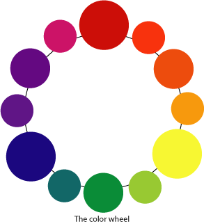
Harmony is the visually satisfying effect of combining similar, related elements within a defined space. Harmony is created when all parts of an image relate and compliment each other. This may be achieved by using elements that share a common trait or two. A common trait might be: color, shape, texture, pattern, size or even theme. Some ways to achieve harmony are to use adjacent colours on the colour wheel or to use similar and/or repeating shapes on your layout.
In this example Kathy used the "Let it Snow" line from 3 Bugs in a Rug. Red and blue are adjacent to each other on the Color Wheel, which creates harmony. To further achieve harmony, Kathy used similar shapes throughout the layout. She repeated the circles from the tree on the left underneath her photos with the brads and to the left of the photos with the red circles with snowflakes in the center. The use of the repeated circle element draws the eye around the layout; pulling the visual image together. Here are some other ways harmony could be created on this layout: use of multiple and/or repeated elements such as snowflakes or snowmen, addition of the color green or adding a circular journaling spot to record your memories!

Here is another example that is totally different, but still demonstrates harmony.

The use of similar elements (dots, poinsettias and trees) and the use of red and green, colors which are adjacent on the color wheel, pull the image together to create harmony in the page.

Using complimentary colors and repetition are two ways you can create a layout with harmony that will be sure to knock any viewer's socks off!
Additional ways to create harmony:
use of similiar fonts
use of related photos
use of similiar textures throughout the layout and
uniformity of size for elements/embellishments

We hope you will use this lesson in harmony to find exciting ways to add harmony to your layouts! In fact, we challenge you to create a layout demonstrating harmony and upload it to our gallery by November 15th at 12midnight for a chance to win a Croppin Paradise Gift Certificate!

See you tomorrow!
xoxo
Trish

Croppin Paradise Design Series

The Design Team at Croppin Paradise has been hard at work again!

We realize, that while our main goal as scrapbookers is to record the memories of our lives for future generations, we often get hung up in how visually pleasing our pages are (or are not)... Sometimes pages will sit on my desk for days, elements unattached, because I cannot make them work!

Have you ever browsed the gallery (or your own albums) and spotted pages that stand out immediately? Are there pages that you look at and just cannot figure out why they don't seem to work?

Those "perfect" pages are usually ones that follow some of the most simple design principals. The principals of balance, gradation, repetition, contrast, harmony, dominance and unity.

This week at Croppin Paradise we hope to demystify these principles of design and help you incorporate them into your scrapbooking pages to help you create great, eye catching pages every time you sit down to scrap!

Also, each day will include a new challenge with a chance to win a prize! (challenges will be open until November 15th at 12midnight)

See you here tomorrow!

Saturday, October 31, 2009

Happy Halloween!!!

Happy Halloween!!

Tonight is the night! The ghouls and goblins will be out begging for candy! Are you ready?

The Croppin Paradise Design Team is certainly in the Halloween spirit! They have brewed up some spooky layouts using some great Halloween inspired lines from the store to inspire and scare you!

Lisa -Pink Paislee Twilight Collection

Andrea - Little Yellow Bicycle Trick or Treat

We hope you have a safe and frighteningly spooky Halloween! Don't forget to take plenty of pictures; you will need them to use up all these Halloween products in the Croppin Paradise store!

xoxo

Trish


Monday, October 26, 2009

Another Design Team Reveal!

Clue #1 - This is a greeting that will not leave you out in the cold!
Clue #2 - Don't be so nosey; people with think you are cold

and the answer.........................................


The Design Team (plus our talented Guest Designer this month) created some wintery (and not so wintery) creative projects using cold weather inspired line! Enjoy the creativity of these projects:
Trish - "Snow"

Joan (GDT) - "Snow"

Lisa- "Sugar Plum"


Kathy - "Our Little Present"

Thanks for looking! Don't forget to head to the store and pick up your Basic Grey Eskimo Kissess before it is all gone!


Tuesday, October 20, 2009

Meet Guest Design Team Member - Joan

If you have been stopping by to see us in Paradise, you may have noticed a talented and fun scrapper joining the ranks of the Design Team! In September we held our first Guest Designer Challenge and the winner was:

Joan Borgelt!!

I wanted us all to have a chance to get to know her so I asked her some questions - here are her answers..

1) How long have you been scrapping?
I have been scrapping for about 12 years.

2) How did you get started with scrapping?
My brother-in-laws girl friend invited me to a Creative Memories party and I was hooked.

3) What are your 3 favorite manufacturers?
It’s hard to pick just 3, but I LOVE 7 Gypsies, Basic Grey and Making Memories.

4) Where do you draw most of your inspiration?
I’m inspired by everything and anything . . . sketches, new techniques, fashion, magazine advertisements, paint swatches . . . and the list goes on.

5) If you were to describe your style, what would it be?
I have a combination of styles:
Hip/Modern – I like trying new techniques and my color choices are bold and assorted.
Romantic – Distressing and inking are my favorite techniques. I love layering paper and if I can find a way to use ribbon and flowers on a boy layout I will.
Shabby-Chic – I love all things vintage, well worn and peeling. Experimenting with mixing colors, patterns and textures is very forgiving. My mistakes are taken as part of the look I was going for.

6) Is your scrap space messy or neat?
Most of the time neat – I’m one of those people who has a place for everything and think everything should be in its place. I’ll finish one layout and put everything away before I start another.
7) Do you snack while you scrap? What is your favorite scrappy snack?
I don’t snack while I’m scrapping but I do have to have my diet Mt. Dew

8) If you could scrap with any “Celebrity Scrapper” who would it be and why?
There are so many talented scrappers out there! I’d have to pick Jenny Bowlin because I’m in awe of her shabby/vintage style.

9) What is your favorite part of being a member at CP?
When looking for a scrapbooking site to belong to it was important for me to find one where the members were friendly, uplifting and fun. I also wanted a site that offered new products and was full of inspiration. I found it all at Croppin Paradise along with some excitement with all the great contest and challenges.

I also got the chance to peek at some of Joan's fabulous work !!! and because I am nice, I am going to share...


Tuesday, October 13, 2009

Did You Guess Correctly?

Clue #1 - Don't Be Scared.. It's no trouble to guess this line...
Clue #2 - We aren't trying to trick you!

Did you guess the line to be My Mind's Eye The Spiderweb Collection? - If you did.. you are CORRECT!!!

Lisa and Carolyn designed awesomely spooky projects with this line - Check them out! (and then run to the store to shop!)


Pumpkin Patch by Lisa

Mini Album by Carolyn

If you want to see more of Carolyn's fabulous album, you can see it in the Croppin Paradise Gallery: http://www.croppinparadise.com/idea-gallery/showphoto.php/photo/8939

Meet Andrea!!!

Hello Everyone in Paradise!


I did not forget that we still have more of our fabulous Design Team to introduce to you; I just got sidetracked and excited because we got to reveal the winner of our October GDT Challenge!


Now that my excitement has been contained, it is back to business!


Today I would like to introduce to you all the crazy talented Andrea!!!


My name is Andrea and I live in Nampa, Idaho and am married to my truck lovin’ husband of 6 years. We are blessed to have two beautiful red-headed daughters ages 5 and 3. I am a 3rd grade teacher who loves to read books, craft, and watch movies. You can find me spending time with my family or enjoying a cup of coffee with my friends.


What I like most about crafting is that natural high that I receive after I have finished a project. I love working with products to create a work of art. My favorite thing would have to be the look on someone’s face as they are looking at the art piece that I have hand-crafted especially for them.


I have been scrapbooking off and on for the past 12 years. It all started with a Creative Memories party as the story often goes. I soon grew out of Creative Memories and now I find myself buried in cardstock, patterned paper, and lots of fun embellishments! My style is fun and sometimes a little quirky. I love to hi-light my photographs and I work really hard to capture a special moment in time be it a photo of one of my daughter’s birthday or a simple flower.


It's hard to narrow it down, but I am giant fan of Basic Grey, American Crafts, Heidi Swapp, and Prima to name a few. My favorite techniques include distressing with sandpaper and ink, stamping, and layering. I also enjoy a good hand cut embellishment as well!


Here are some projects Andrea created using some great newer lines in the CP store!

The first two use the Patriotic Piggy Tales Yankee Doodle Dandy line! I love how she took the line and used it for a non 4th of July subject! Red, white and blue is not just for the July holiday!!

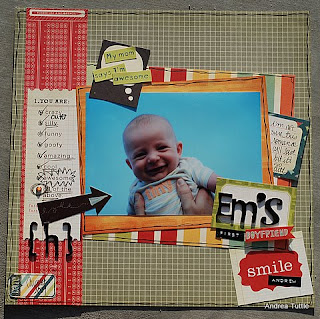
This project uses the My Mind's Eye Ooh La La for Him line. Andrea did a great job of mixing these papers to create a masculine layout!
If you have enjoyed "meeting" Andrea, please come join us on the message board to meet the rest of the team and some of our awesomely creative members!


xoxo

Trish

Sunday, October 11, 2009

The Design Team has been wandering around with the Dukes.. ..

LOL!
The clues went out and Kim (arbmommy) guessed it! The DT has been busily designing with the Bo Bunny Gypsy line!
Kathy created this beautiful layout about her daughter! I love the contrast of the green and brown and the jewels add the right touch of glitz!
A former member of our team, Carolyn (we miss you!), created this fabulous page about a goldmining trip. These papers have the perfect rustic, yet rich, feel to them that make them perfect for this layout!

I was lucky enough to receive the Gypsy line in a kit club that I design for. I used it to make this oragami kusudama ball. I love how it turned out and it is perfect hanging in the corner in my formal sitting area!

I hope this has inspired you to "wander" over to the CP store and pick up some of this beautiful collection! You will not be sorry!

xoxo

Trish

Thursday, September 24, 2009

What is a favored male companion who is out of this world!

Cosmo Cricket - The Boyfriend, that's what!

The Design Team has been hard at work creating these awesome products using Cosmo Cricket The Boyfriend line!

Trish

Lisa

Andrea

I hope you feel inspired!

Tuesday, September 22, 2009

Weekly Challenge- Use an Action on a Photo then Scrap IT!


Hi All....this week's challenge is to use an action on a photo to alter it (not just improve it) and then scrap it! In this case, I used a Color Splash action that allowed me to return color to just the portion of the photo I wanted to....this was an app for my iPhone but Piknick has the same action for free or maybe you even have photoshop skilllz!


There is a Rak involved with this week's challenge! I have a baggie of fun doo dahs from the Making Memories Just Chillin line I used in this layout....for each entry into this week's challenge I'll put your name in a hat and pull one on Wednesday...deadline is next Tuesday the 29th. Have fun with it!

Lisa

Sunday, September 13, 2009

Meet Carolyn!!!

Yes, there are still more fabulous Design Team members to meet!

Today I want to introduce you to the talented Carolyn!

Hello! My name is Carolyn Lontin. I have been married to Rick since January 1997; we have one son, Seth (2001) and two crazy dogs! We live in gorgeous Colorado, in a suburb just south of Denver. We are less than 20 minute drive to the mountains and love to go there often!

I began scrapping in October 2001 to preserve my son's childhood memories and it quickly became an obsession! I love capturing my family's "real" moments both in my photos and in my journaling on my layouts and projects. I have found the creative outlet of scrapping to be incredibly relaxing and quite addictive, which is shocking to the previously dominate non-artistic side of me! Over the past few years, I have had the honor of having my work published along some awesomely talented scrappers in major publications!

Since April 1994, I have been a Human Resource Director for a manufacturing company. I also enjoy spending time with family and friends, photography, exercising, cheering on my son's sports teams, mini-adventures exploring in the mountains, playing with our dogs, and reading.

It's great being part of the Croppin' Paradise Design Team!
Here are some creations Carolyn made using products from the CP store!

Rusty Pickle Rockin America

Weekly Challenge 9.14.09


Card . . . Card. . . Pick a Card Challenge


So I used some Piggy Tales Mary, Mary Quite Contrary papers and embellishments that I picked up over at the CP Store for these cards!!
I started with a kraft card pack of 10 from my local lss . . . I gathered some serious inspiration from Betsy Veldman and my July/Aug. Paper Crafts issue (see page 64 and 65) . . . and then I went to town . . .


My challenge to you is to pick a card . . . any of the cards and re-create it . . . if any of you is bold enough to re-create all 5 by weeks end . . . I will give you my 5 cards!!

Have a GREAT week!! Andrea